


Log
oCol
lec
tion


A collection of branding work and logo design.
- Branding
- Animation
- Graphic Design
Dip Print Studios
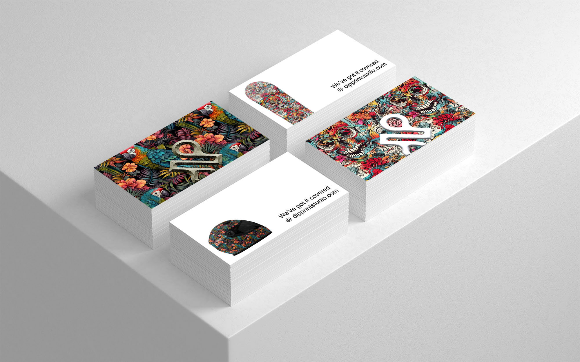
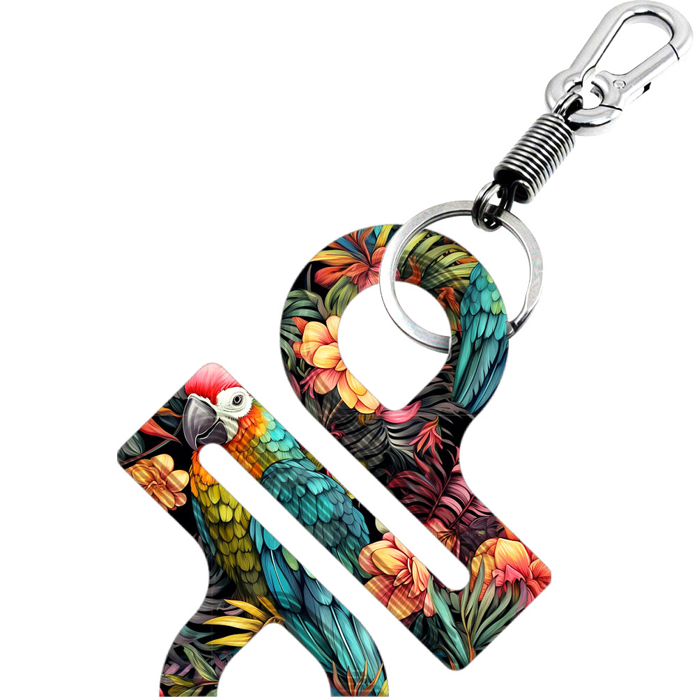
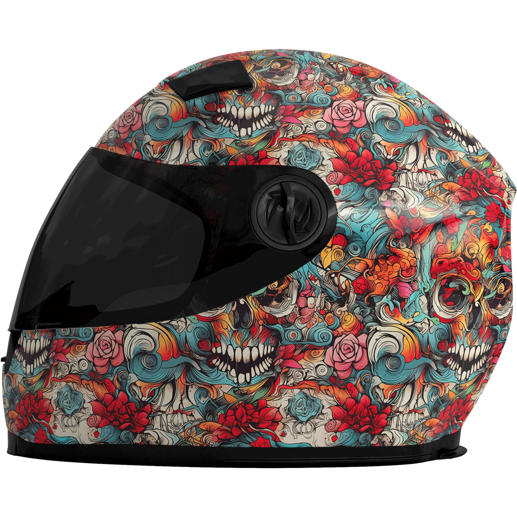
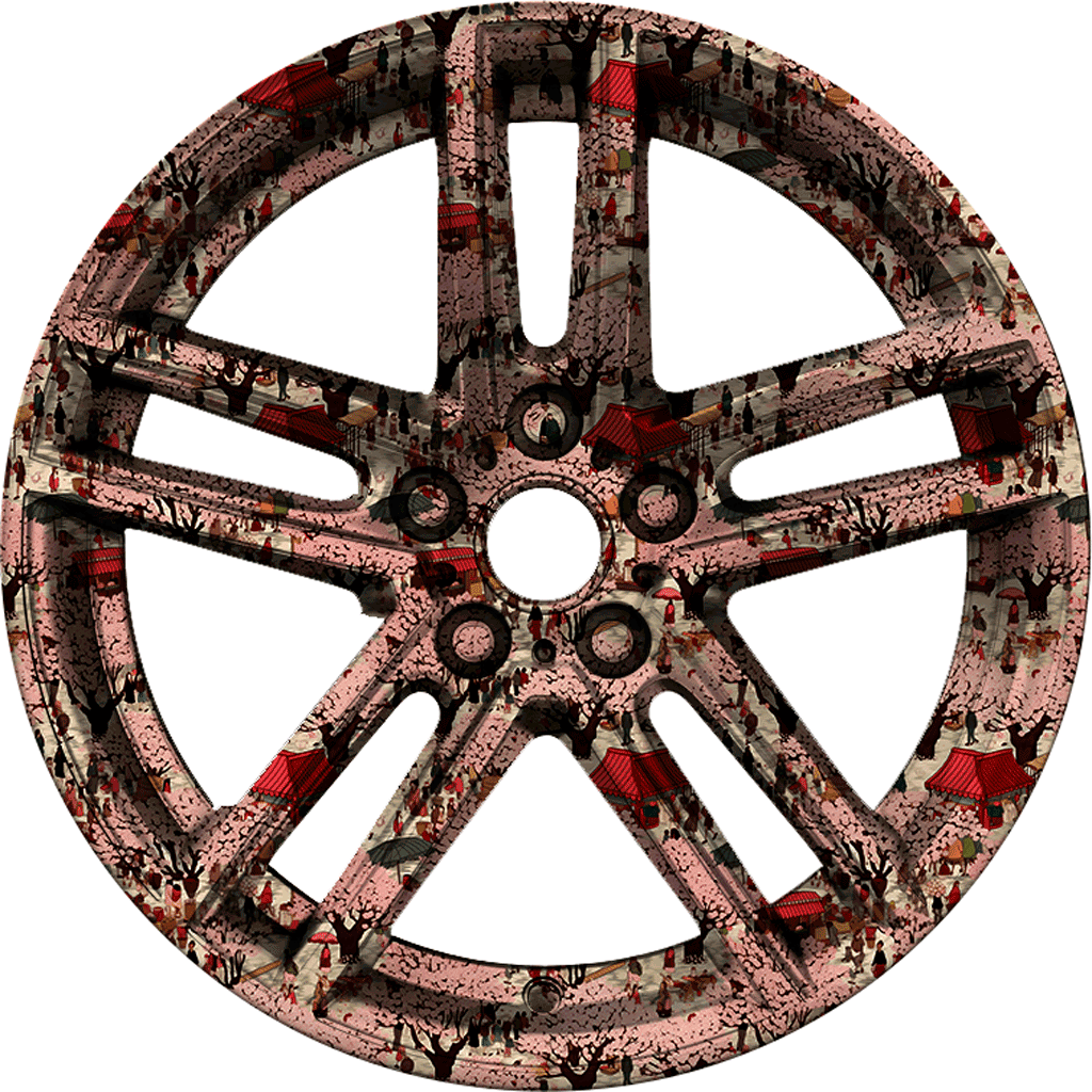
Dip Print Studios is a start up company that specialised in hydrographic printing, where a print design is applied to a three dimensional surface by dipping the object in a water transfer. They required a fun and playful logo and identity that helped communicate the relatively unknown procedure whilst making sure it became synonymous with their studio.

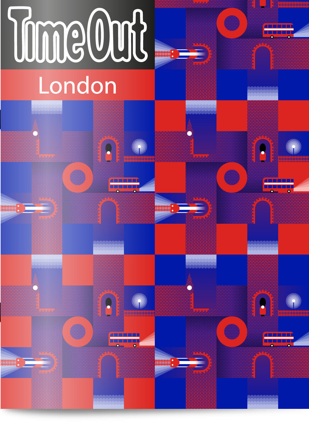
London
TimeOut London ran an illustration competition to be featured on their front cover.

Omnipotent Analytics
A monogram of the O and the A and a variation on the thaumaturgic triangle: If you drew a square inside a circle, our triangle then sits snug inside this square - usually all the triangle corners touch the circle's circumference. Conveniently the thaumaturgic triangle represents trinity, energies and power, very similar to the definition of omnipotent - "having great/unlimited power or influence". The background behind the symbol is a conical gradient that represents a radar. This ties in nicely with the idea of analysing data, but visually it gives us an interesting vehicle in presenting and enforcing a brand identity across different verticals.


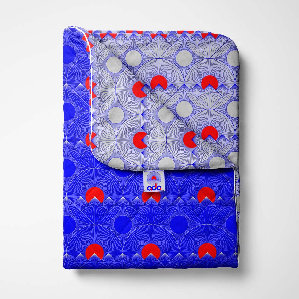
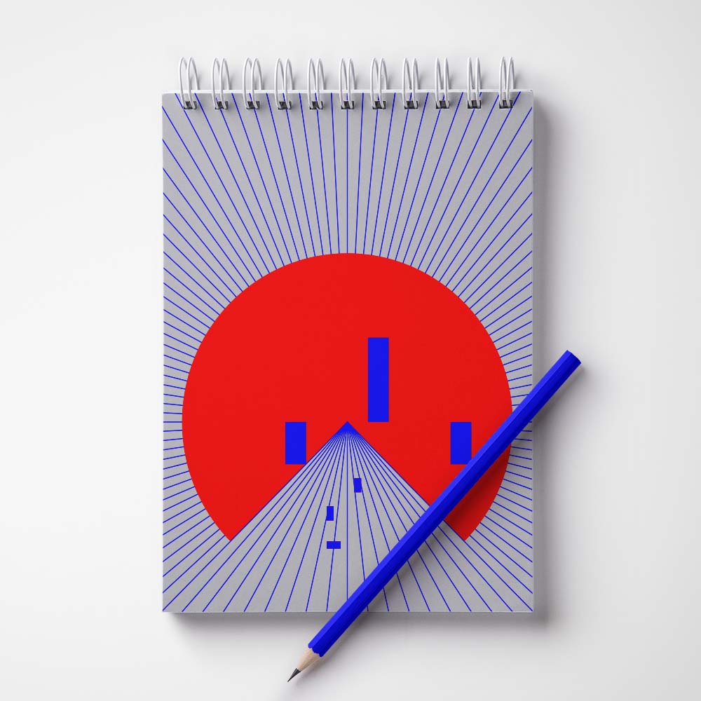
Ada 9.10.20
A logo I created for my new born daughter (9.10.20), initially for some 'belongs to' stickers but I developed it into a clock face, poster and even a textile pattern. Coincedentally a friend of ours also had an Ada the very next day (10.10.20) so it made a nice gift to send for their first birthday. It makes me sad to think there are babies out there that don't have their own logo.

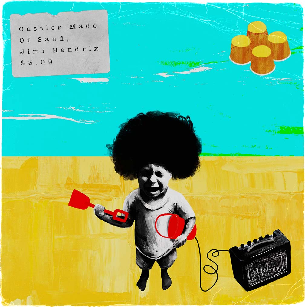
And so castles made of sand, Fall in the sea, eventually.
Jimi Hendrix, 1967
Castles Made of Sand
Secret 7 is a design competition that offers the particpant a choice of seven tracks in which to create a 7" sleeve design. In 2018 I entered designs for "Castles Made of Sand" by Jimi Hendrix.
View project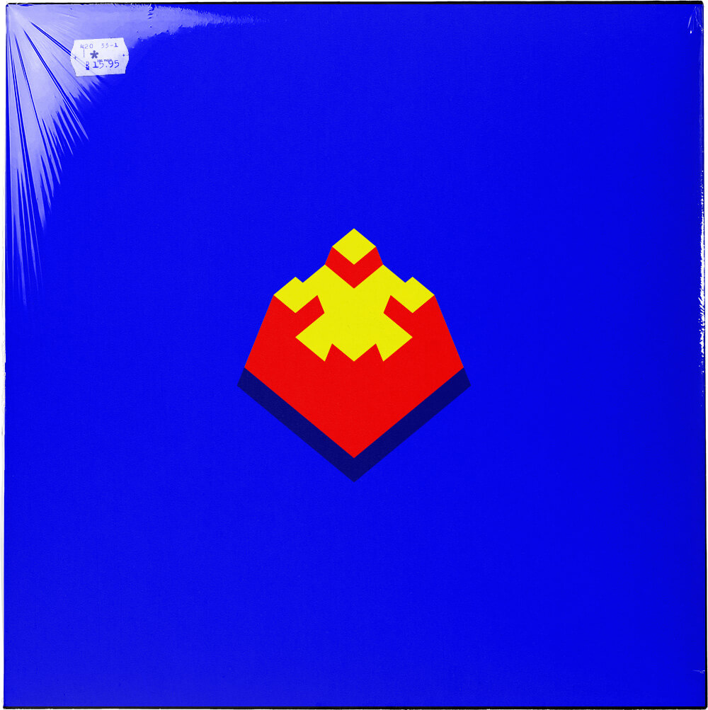


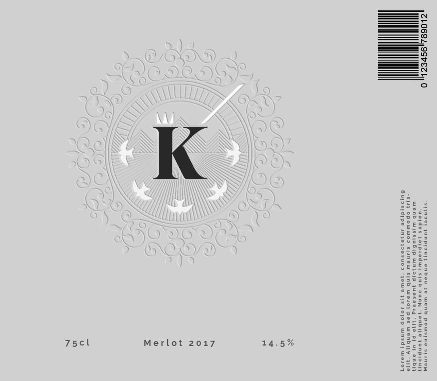
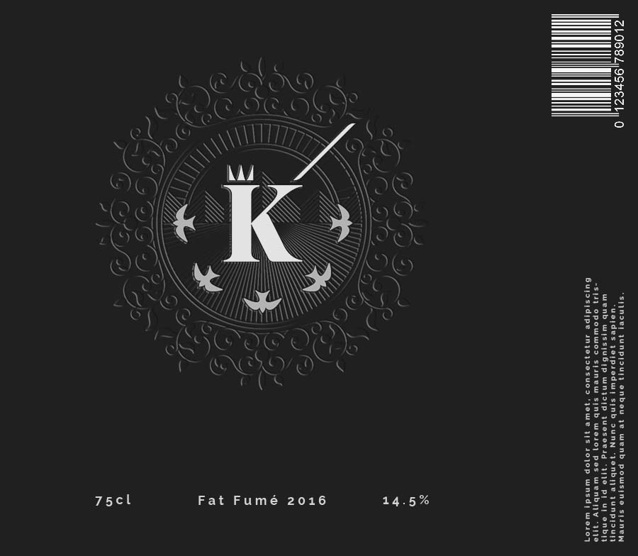
Kingscote
Kingscote is an English wine that required a logo that balanced the modern with the traditional. The K of Kingscote is the valiant king defending his land, with the crown atop his head and his sword held high. Behind him the sun rises over the rollings hills of Sussex, England, the very land he protects, and the plantations of Kingscote vineyard.
View project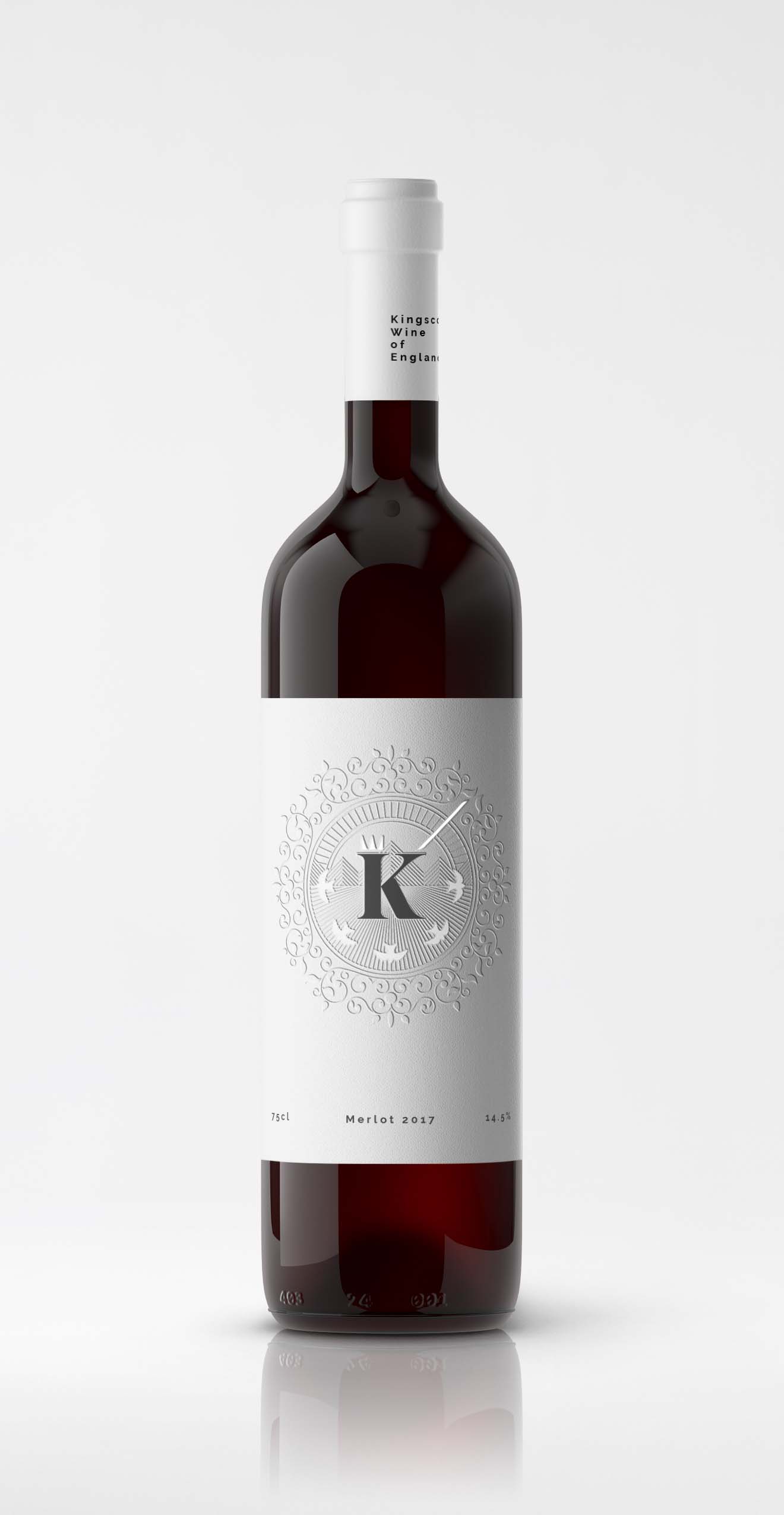


Just Seychelles
Just Seychelles is a tour operator that specialises in the archipelago of the Seychelles. The logo is based on the Frangipani; a flower that is synonymous with the Seychelles. The front leaf folding back is also in the shape of a heart to signify the company and it's customers passion for the islands. The floral radial gradient doubles as an island sunset.
View project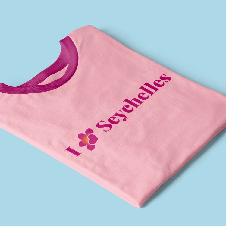


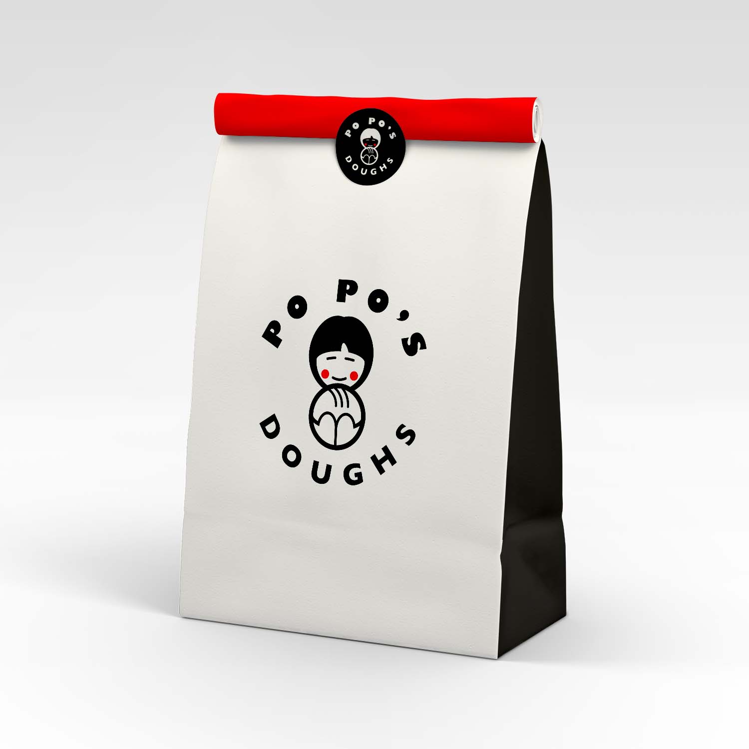
Po Po's Doughs
My mother in law is always baking her family and friends delicous sourdough. For her birthday I created her a logo which I had printed on stickers and paper bags she could deliver the bread in. Po Po is grandmother in Cantonese.


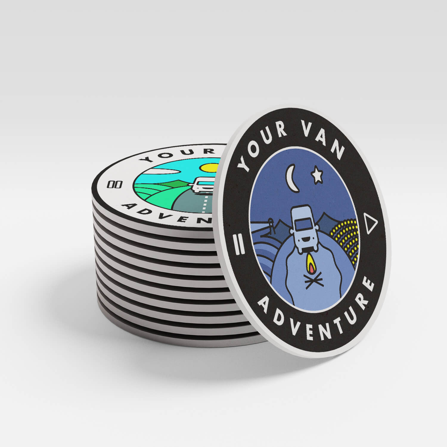
Your Van Adventure
A van company that rents out souped up vans to travellers who want to explore Australia. The video game inspired logo can be 'played' or 'paused' and shows the two contrasting benefits of travel - exploring and relaxing!
Funfair
FunFair is a UK startup that utilises the blockchain to provide casino and slot games that are provably fair. The main logo and value proposition logos were created from an isometric cube to allude to the blockchain technology that forms the companies foundations. The cubes are transparent to reflect the transparency and fairness of the transactions. Whilst technical and sophisticated, the logo's aesthetics still maintain a sense of fun.
View live prototype


Adeptly
A SASS company that provide a tool to learn through play. The logo symbolises a conventional play icon folding out from a book.
View project
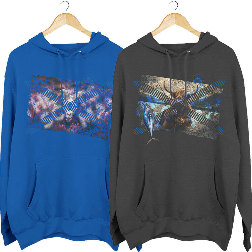
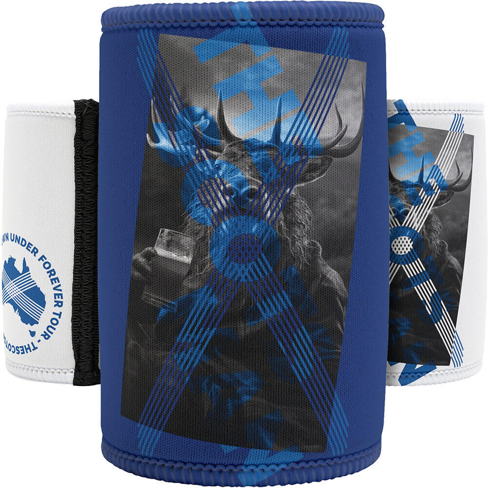
The Scotsman
My friend required a logo and website to promote his services as a professional musician. The logo is based on St. Andrews cross of the Scottish flag, each diagonal is made up of the four ukulele strings.
View project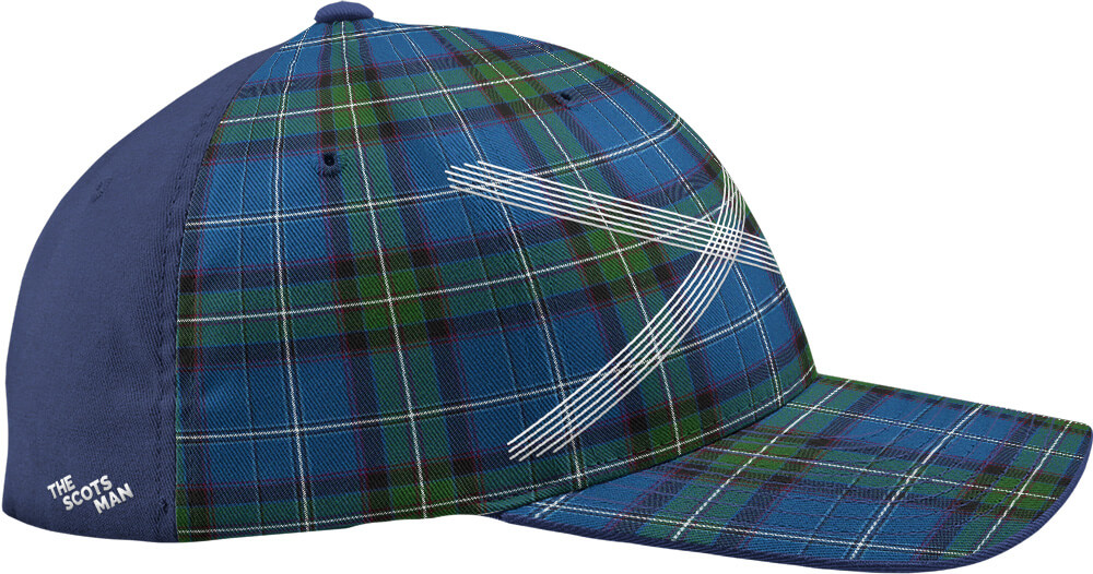
Website and content designed and built by Pete Moores © 2022