


Spo
tify
ofm
yDre
ams

A clean, exciting interface that pushes more content
An uninhibited banner provides the homepage with some personality and estate for valuable personalisation campaigns.
The right hand side column lets us surface charts, trends and shares and keep the main content recommendation rows at a digestible length on wider viewports.
Play the prototype
Motivations and tasking
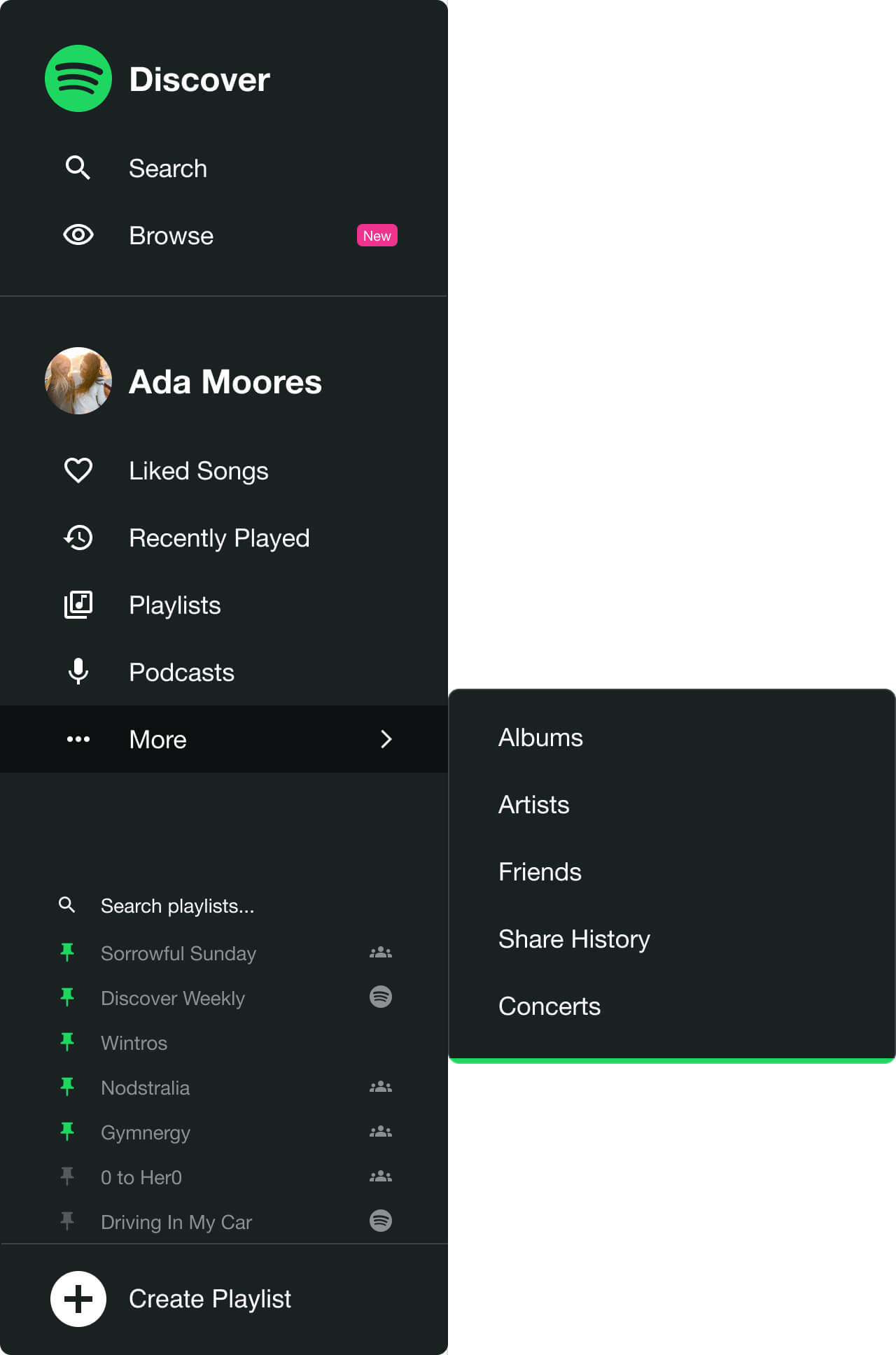
The main menu presents as a narrow bar of icons that can be progressively disclosed when required. This reduces the excessive cognitive demands of an omnipresent and exposed navigation and enables the user more focus on proximate tasks.
To help inform the users mental modelling the global menu is divided into two sections that mirror the two main motivations of a session; discovering music to build out the users library, and efficiently accessing saved music from the library.
The former is now three sections consisting of 'Discover' (The homepage), Search, and a new powerful Spotify Browse tool.
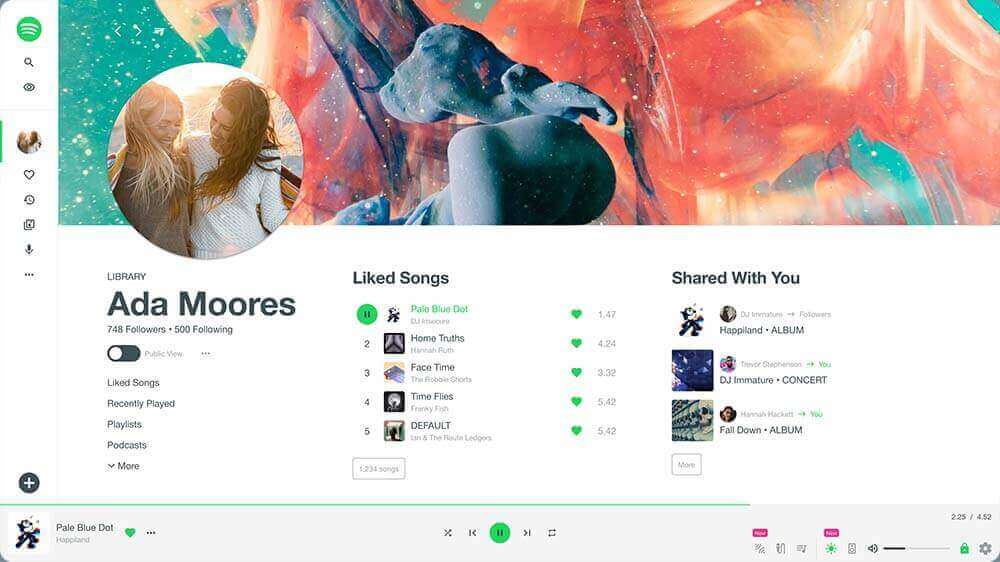
The profile and library are merged to remove overlap, reduce confusion and remove the friction of an unnecessary choice. Frequent journeys like returning to a recent activity or launching a pinned playlist are surfaced for expedition.
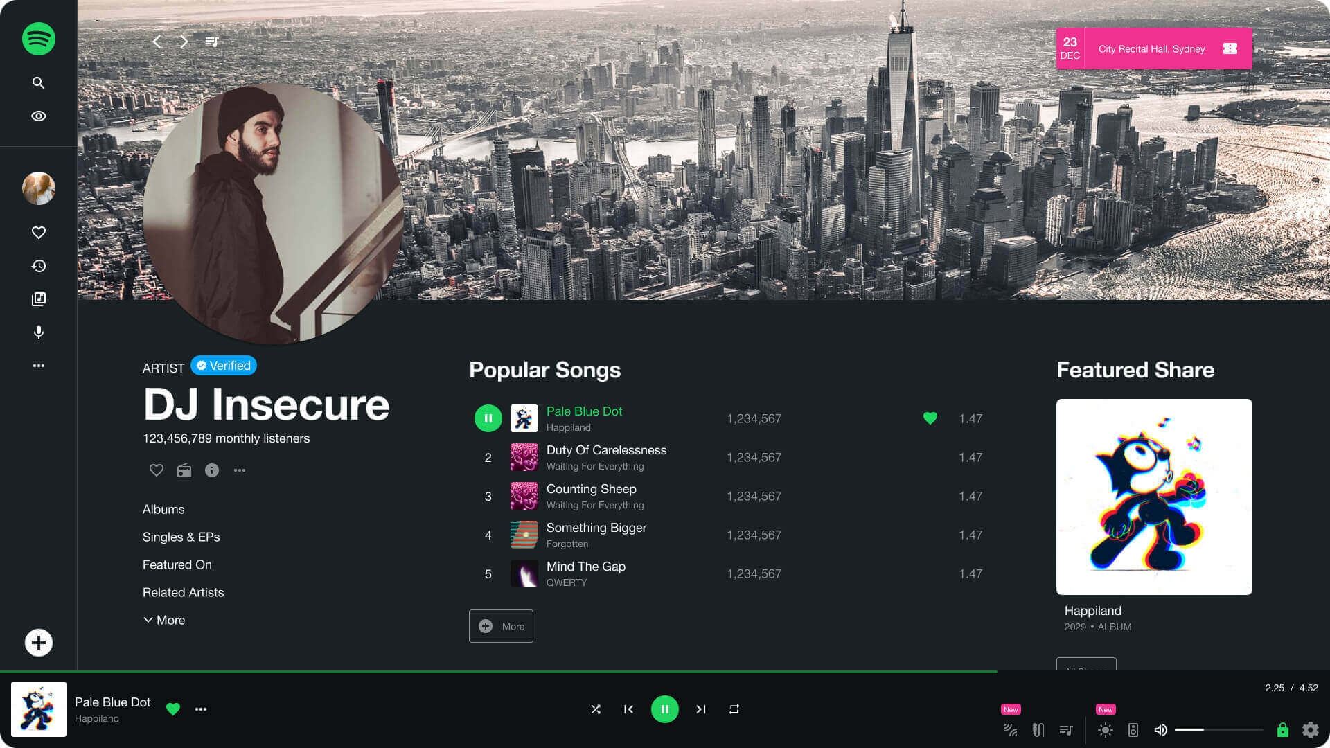
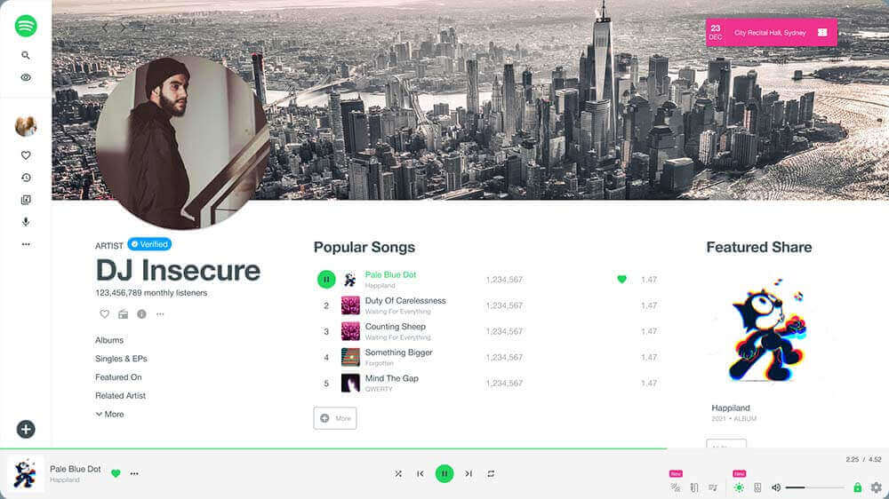
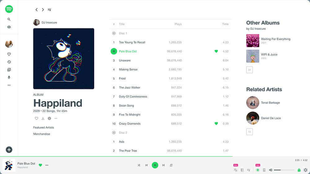
More signposting
For artist, album, playlist and library sections there is a fixed contextual panel where a title and substantial image give the section an identity to aid wayfinding - a healthy compromise on content space for the advantages of clearer orientation. The most frequented tabs and main actions are surfaced for sectional navigation.
Play the prototype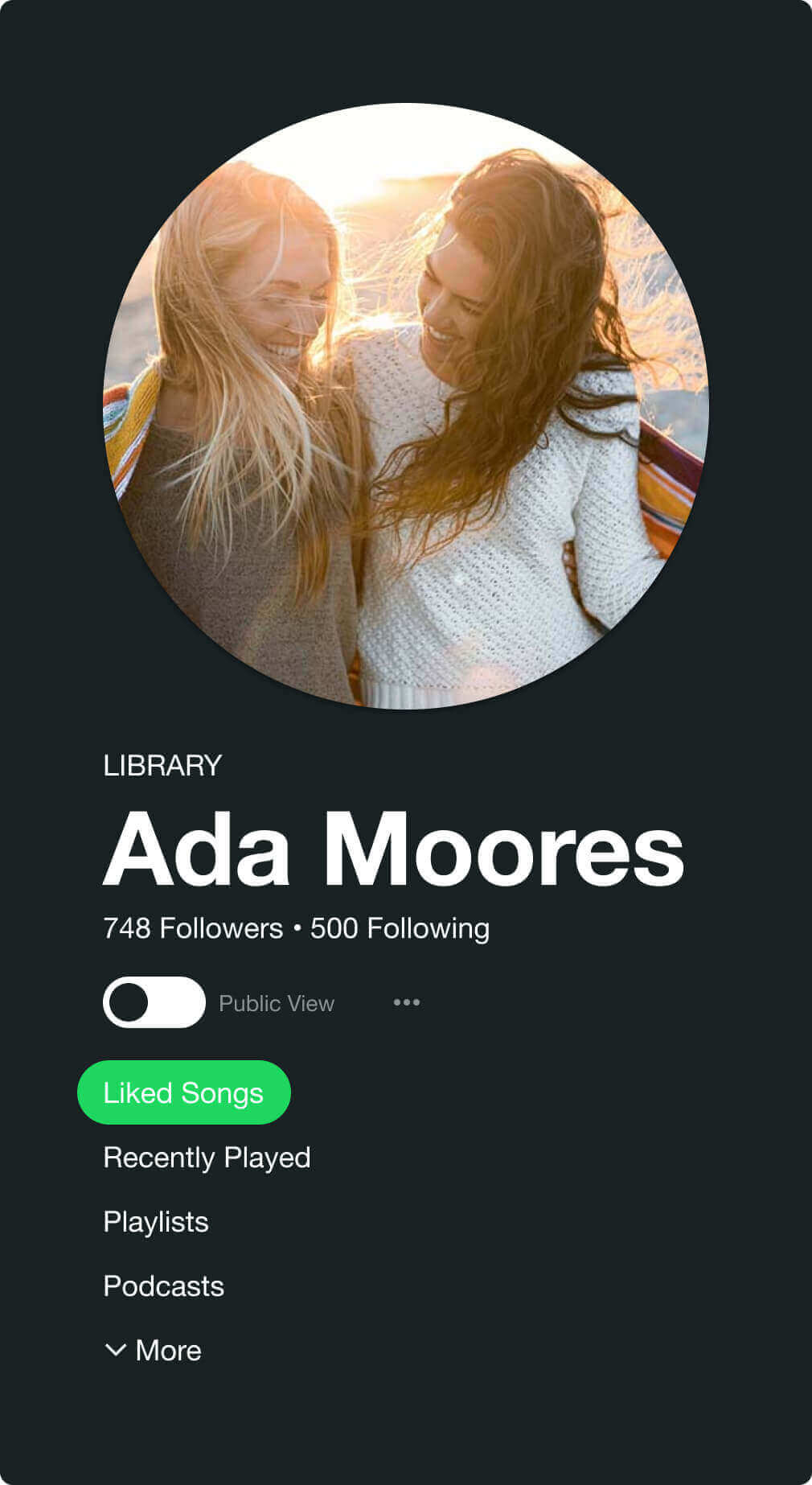

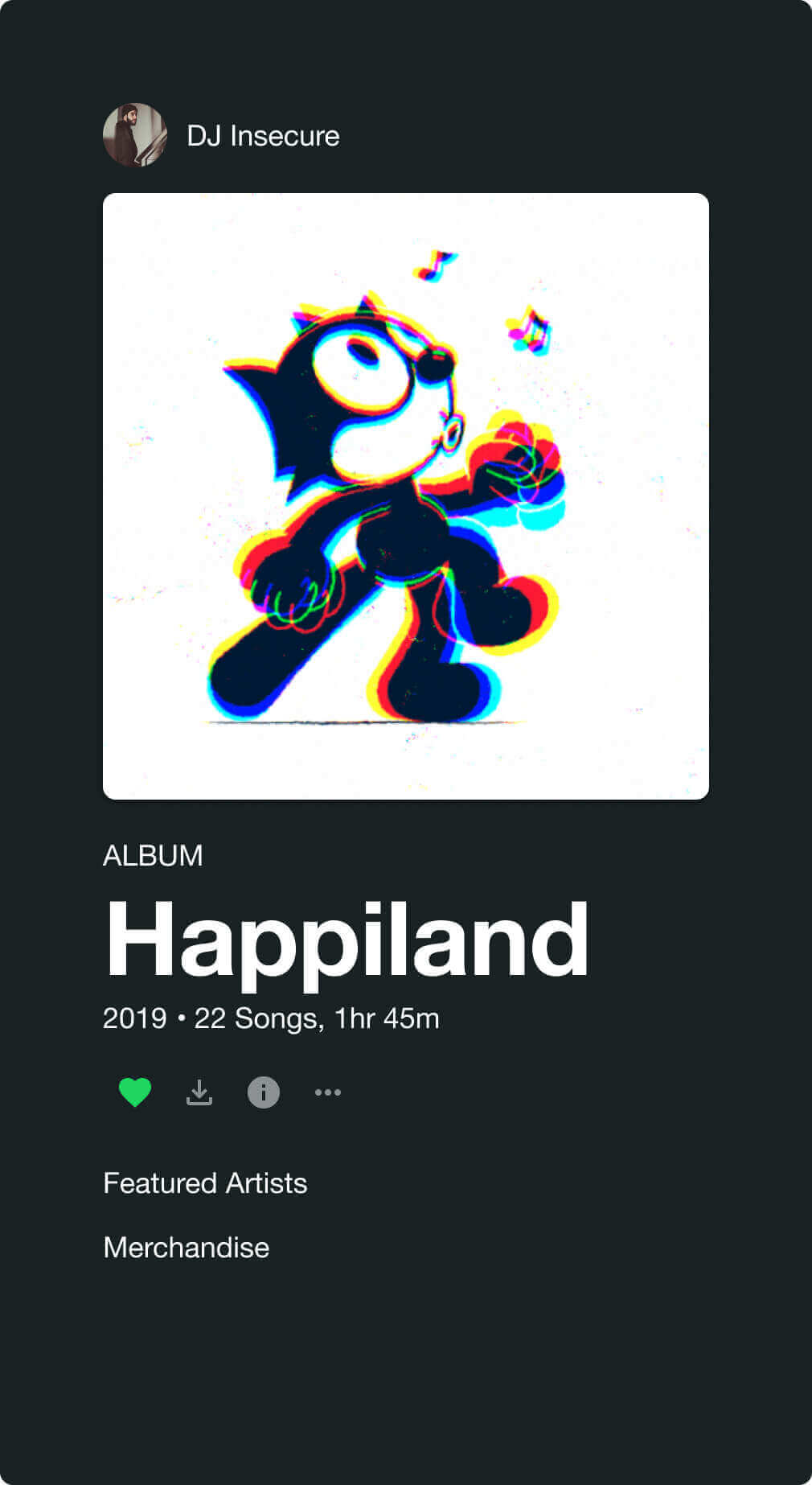
Bring back the art
Often the first experience we have with an album is when we look at the cover art - sometimes it can even dictate whether we listen. During the latter half of the 20th century there was a stronger marriage between music and art which has naturally eroded a little with the digital revolution.
The new 'Rate this cover' feature adds value and prominence to the art and could provide a useful means for the smaller artists to find exposure where the nature of the existing algorithms might limit it. In the new Spotify Browse there is an option to browse albums purely by cover design, ordered by user rating or completely randomised, so this generation get the chance to peruse content by cover art without well intentioned algorithms limiting their options.
Play the prototype

A Whiter shade of pale
Despite the current clamour for dark modes there's a lof of evidence that a positive contrast polarity still holds useability advantages. Providing this option gives the user power of autonomy. I also think Spotify on white looks pretty fresh while the green accents carry the brand through well.
Play the prototype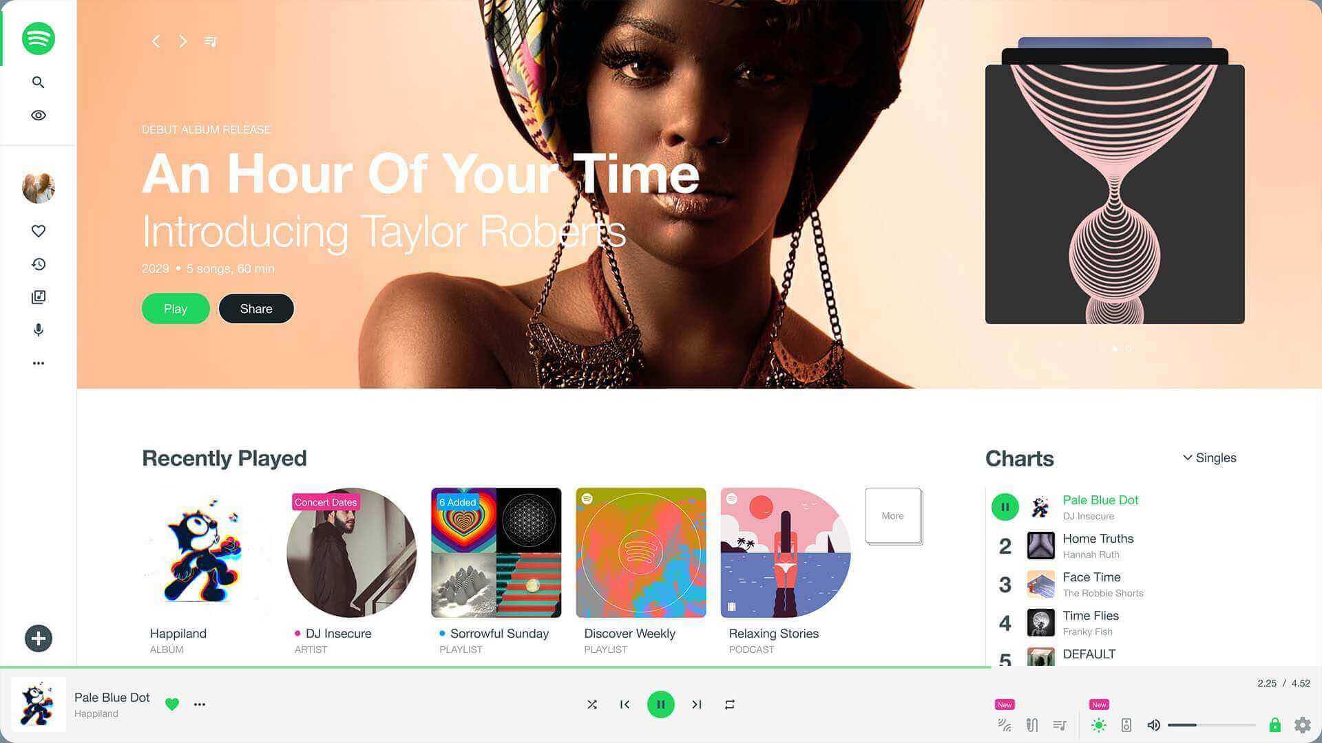

Bring back the house party
At the turn of the century most people used a Limewire and Winamp combination to download and listen to music, the process was inferior and less legal than the Spotify streaming model. However, one feature Winamp did have that was incredible was third party visualisations that you could watch react to the music. Just imagine what the next generation of Milkdrops could achieve now.
Play the prototype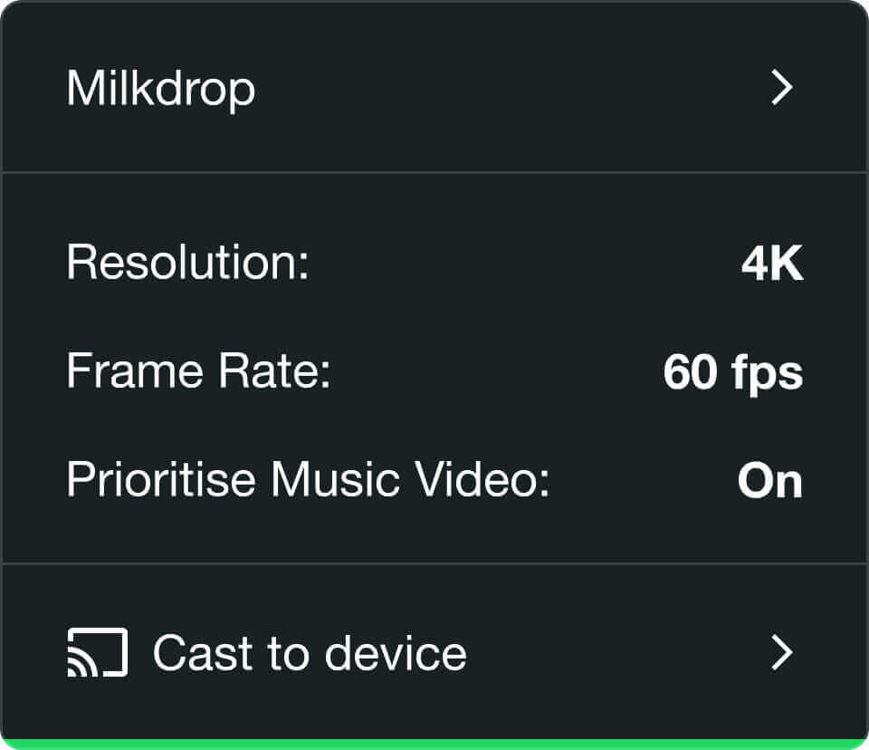

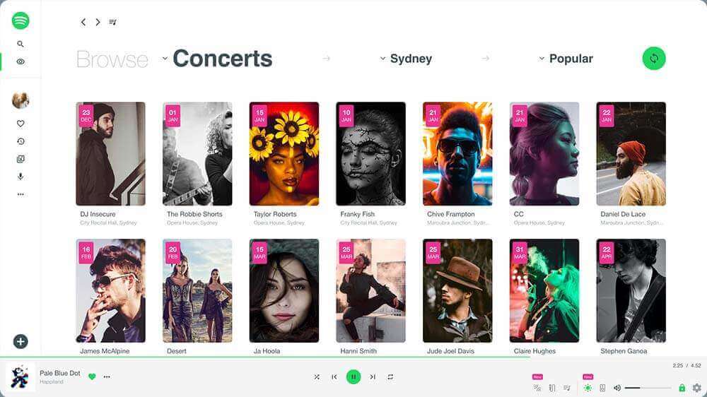
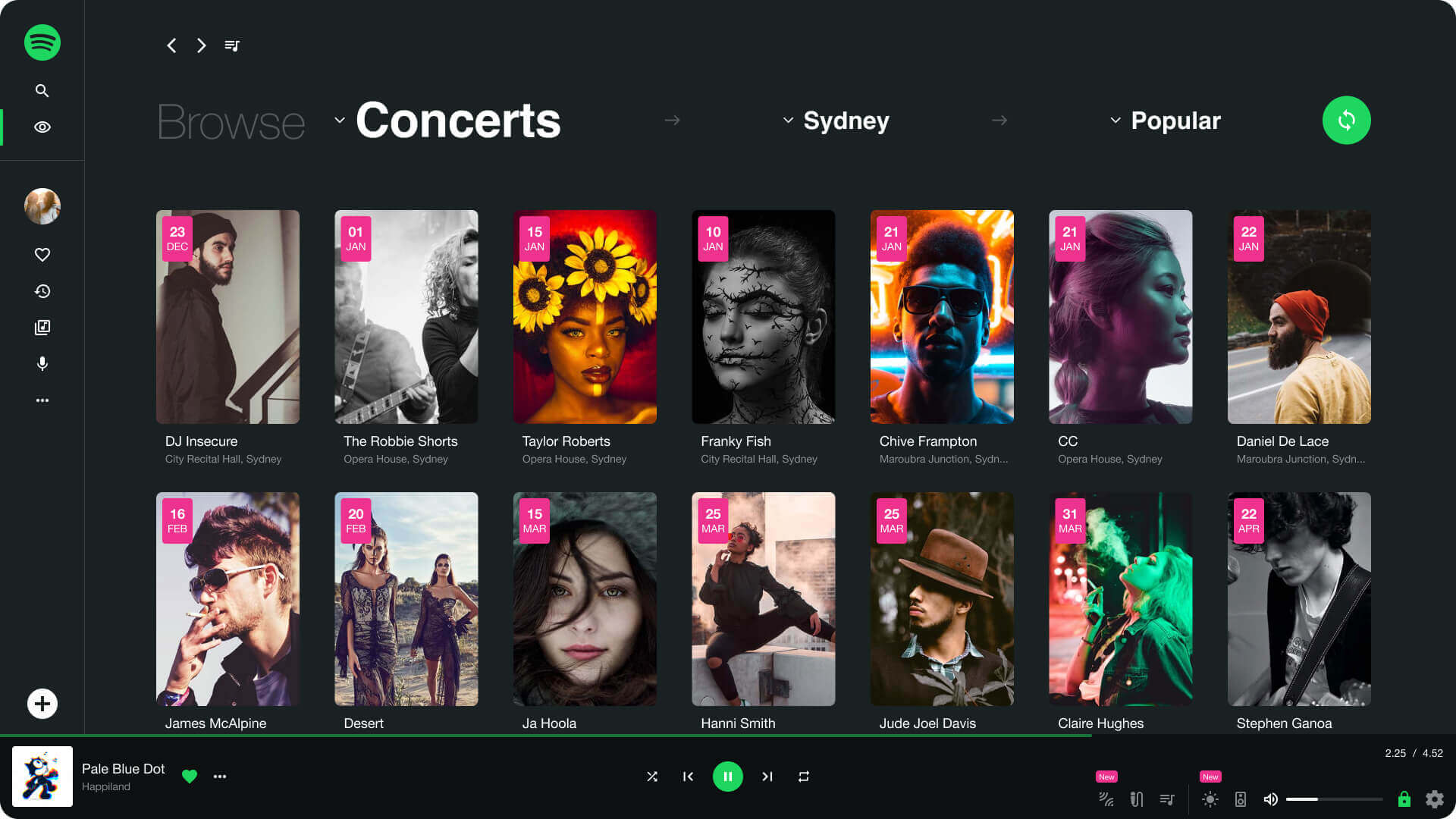
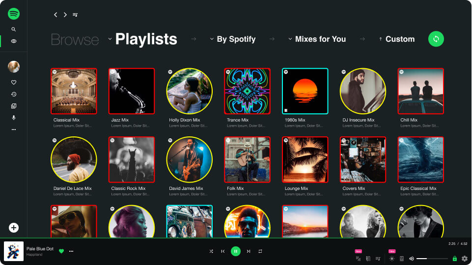
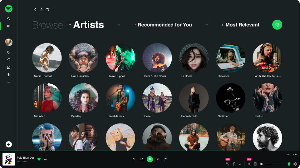
More than just browsing
The browsing menu has been extracted from 'Search' and surfaced at the top level of navigation to reflect it's importance in the discovery process. It provides the user a playful system which grants more power and influence over the algorithms at play. All selector menu options are dependent on the proceeding choice made in the hierarchy. Aimlessly hitting the magic shuffle button throws up random but relevant filter combinations like those surfaced on the homepage.
Play the prototype
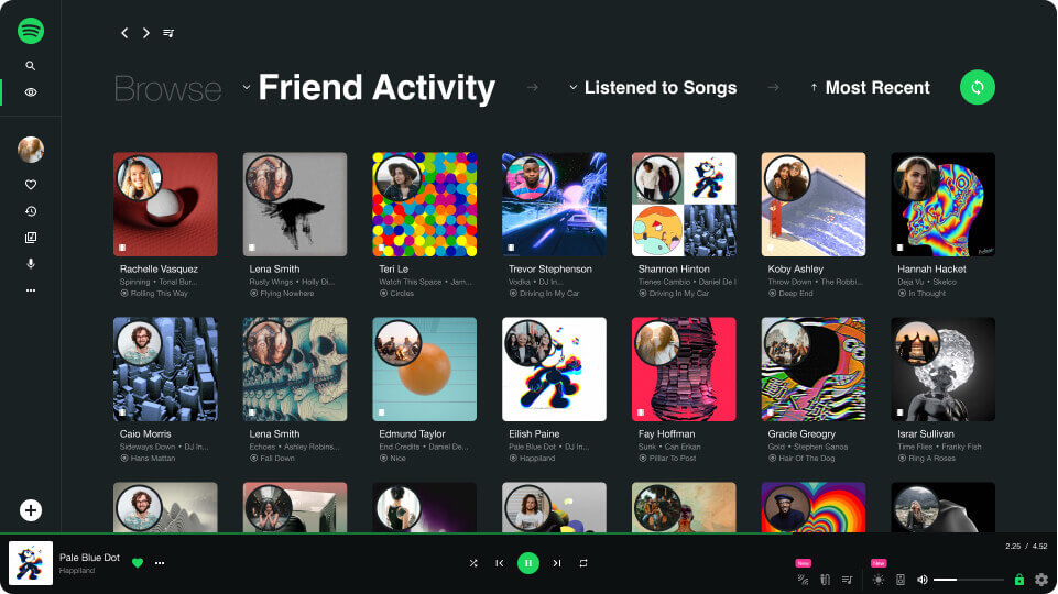


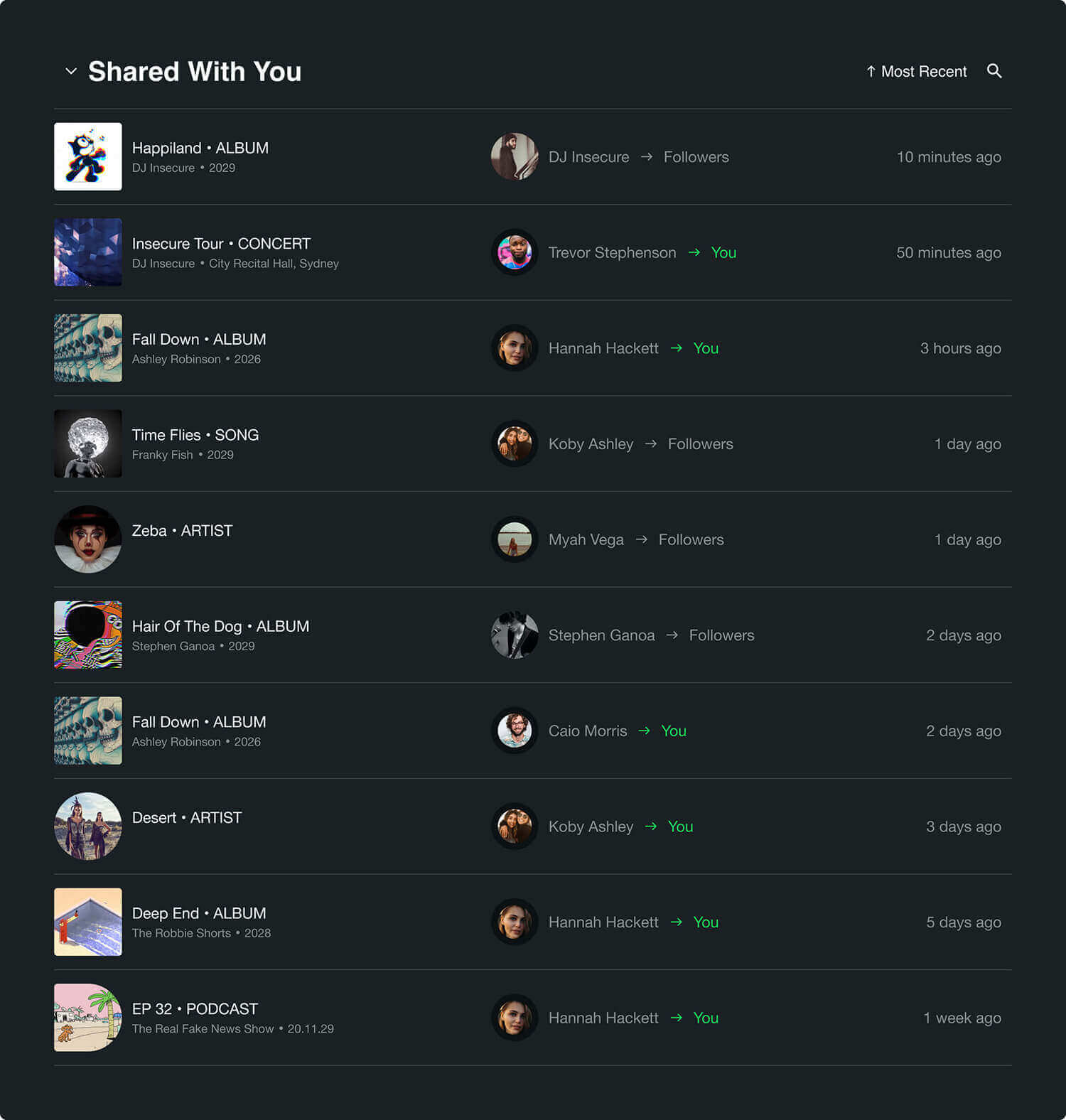
Sharing music can help you make more friends
Even though you had nothing to do with anything in it's creation, sometimes being the first to share some good music amongst your peers makes you feel like you have co writing credits, and for the business it's a great organic way to expose relevant content amongst users.
I doubt anyone wants Spotify to turn into another social network behemoth, however the ability to share music is currently limited to pasting a link outside of the app. With the new Spotify Share the process is streamlined and more productive; you need never leave the app, and you, your friends and the artists have the ability to share with individuals or alert all your followers. Then, all your historical outgoing and incoming shares are logged and forever accesible in your library, just in case you need to check who shared what with who first.
Play the prototypeAttributions
GIFs:
![]() @xponentialDesign
@xponentialDesign
![]() @skittlemerrmaid
@skittlemerrmaid
![]() @joewinograd
@joewinograd
![]() @ellooutside
@ellooutside
![]() @sahlooter
@sahlooter
![]() @borrachas1
@borrachas1
![]() @dualvoidanima
@dualvoidanima
![]() @gregorymartinson
@gregorymartinson
![]() @vaporwaaved
@vaporwaaved
![]() @gustavo
@gustavo
![]() @bujomom
@bujomom
![]() @unknown
@unknown
![]() @unknown
@unknown
![]() @palmi
@palmi
![]() @moonbounce
@moonbounce
![]() @unknown
@unknown
![]() @unknown
@unknown
![]() @tomasbrunsdon
@tomasbrunsdon
![]() @falcaolucas
@falcaolucas
![]() @peekasso
@peekasso
![]() @symmetryinchaos
@symmetryinchaos
![]() @claudioparentela
@claudioparentela
![]() @unkown
@unkown
![]() @unkown
@unkown
![]() @xponentialdesign
@xponentialdesign
![]() @xponentialdesign
@xponentialdesign
![]() @kidmograph
@kidmograph
![]() @poerobots
@poerobots
![]() @oritoor
@oritoor
![]() @matthewdivito
@matthewdivito
![]() @Unknown
@Unknown
![]() @falcaolucas
@falcaolucas
![]() @oritoor
@oritoor
![]() @myendwillnotbeonearth
@myendwillnotbeonearth
![]() @unknown
@unknown
![]() @unknown
@unknown
![]() @roberthruska
@roberthruska
![]() @unknown
@unknown
![]() @tdhooper
@tdhooper
![]() @unknown
@unknown
![]() @connorbell
@connorbell
![]() @maelinhon
@maelinhon
![]() @pislices
@pislices
![]() @lobsterstudio
@lobsterstudio
![]() @mikeberadino
@mikeberadino
![]() @eatright
@eatright
![]() @unknown
@unknown
![]() @yifan
@yifan
![]() @unknown
@unknown
![]() @adampizurny
@adampizurny
![]() @MUTI
@MUTI
![]() @oblanchette
@oblanchette
![]() @handymartian
@handymartian
![]() @juliangallese
@juliangallese
![]() @igorbastidas
@igorbastidas
![]() @unknown
@unknown![]() @hypebrain
@hypebrain
 @xponentialDesign
 @skittlemerrmaid
 @joewinograd
 @ellooutside
 @sahlooter
 @borrachas1
 @dualvoidanima
 @gregorymartinson
 @vaporwaaved
 @gustavo
 @bujomom
 @unknown
 @unknown
 @palmi
 @moonbounce
 @unknown
 @unknown
 @tomasbrunsdon
 @falcaolucas
 @peekasso
 @symmetryinchaos
 @claudioparentela
 @unkown
 @unkown
 @xponentialdesign
 @xponentialdesign
 @poerobots
 @oritoor
 @matthewdivito
 @Unknown
 @falcaolucas
 @unknown
 @unknown
 @roberthruska
 @unknown
 @tdhooper
 @unknown
 @connorbell
 @maelinhon
 @pislices
 @lobsterstudio
 @mikeberadino
 @eatright
 @unknown
 @yifan
 @unknown
 @adampizurny
 @MUTI
@MUTI @oblanchette
 @handymartian
 @juliangallese
 @igorbastidas
 @unknown
 @hypebrain
Images:
![]() @brookecagle
@brookecagle
![]() @allefvinicius
@allefvinicius
![]() @sebastiaanstam
@sebastiaanstam
![]() @jaysonHinrichsen
@jaysonHinrichsen
![]() @césarrincón
@césarrincón
![]() @kimsondoan
@kimsondoan
![]() @unknown
@unknown
![]() @danielmonteiro
@danielmonteiro
![]() @mikamatin
@mikamatin
![]() @sammoghadamkhamseh
@sammoghadamkhamseh
![]() @apostolosvamvouras
@apostolosvamvouras
![]() @naeimjafari
@naeimjafari
![]() @allefvinicius
@allefvinicius
![]() @shahinkhalaji
@shahinkhalaji
![]() @olgazabegina
@olgazabegina
![]() @kahariking
@kahariking
![]() @averiewoodard
@averiewoodard
![]() @bettejanecamp
@bettejanecamp
![]() @olegivanov
@olegivanov
![]() @timmossholder
@timmossholder
![]() @calliemorgan
@calliemorgan
![]() @jennifermarquez
@jennifermarquez
![]() @alexandruzdrobău
@alexandruzdrobău
![]() @omarlopez
@omarlopez
![]() @daniefranco
@daniefranco
![]() @lukethornton
@lukethornton
![]() @tamarabellis
@tamarabellis
![]() @hanseiskonen
@hanseiskonen
![]() @alexperez
@alexperez
![]() @jaysonhinrichsen
@jaysonhinrichsen
![]() @arashpayam
@arashpayam
![]() @joshrocklage
@joshrocklage
![]() @clemonojeghuo
@clemonojeghuo
![]() @emadkolahi
@emadkolahi
![]() @milobauman
@milobauman
![]() @jennifermarquez
@jennifermarquez
![]() @austinwade
@austinwade
![]() @alenrojnic
@alenrojnic
![]() @vladfeatured-texta
@vladfeatured-texta
![]() @dominikvanyi
@dominikvanyi
![]() @aminrk
@aminrk![]() @JackFinnigan
@JackFinnigan
![]() @HannahBusing
@HannahBusing
![]() @JedVillejo
@JedVillejo
![]() @Christianbuehner
@Christianbuehner
![]() @albertdera
@albertdera
![]() @ballparkbrand
@ballparkbrand
![]() @joelmuniz
@joelmuniz
![]() @dominicsansotta
@dominicsansotta
![]() @felixrostig
@felixrostig
![]() @unknown
@unknown
![]() @tylernNix
@tylernNix
![]() @ovethmartinez
@ovethmartinez
![]() @omarlopez
@omarlopez
![]() @sammanns
@sammanns
![]() @judeussamson
@judeussamson
![]() @anthonytran
@anthonytran
![]() @brookecagle
@brookecagle
![]() @rendynovantino
@rendynovantino
![]() @princeakachi
@princeakachi
![]() @gregraines
@gregraines
![]() @mattmoloney
@mattmoloney
![]() @gusruballo
@gusruballo
![]() @joshuararle
@joshuararle
![]() @courtneycook
@courtneycook
![]() @thoughtcatalog
@thoughtcatalog
![]() @sonniehiles
@sonniehiles
![]() @candicepicard
@candicepicard
![]() @candicepicard
@candicepicard
![]() @kingacichewicz
@kingacichewicz
![]() @ayoogunseinde
@ayoogunseinde
![]() @jademasri
@jademasri
![]() @jamiestreet
@jamiestreet![]() @kylo
@kylo![]() @manuelnägeli
@manuelnägeli
![]() @blakeguidry
@blakeguidry
![]() @pawelszvmanski
@pawelszvmanski
![]() @unknown
@unknown![]() @michaeltomlinson
@michaeltomlinson
![]() @konstantinaal
@konstantinaal
![]() @xaviercoiffic
@xaviercoiffic
![]() @williamkrause
@williamkrause
![]() @FLY:D
@FLY:D![]() @chauhanmoniz
@chauhanmoniz
![]() @edugrande
@edugrande
![]() @gabrielalenius
@gabrielalenius
![]() @valentinofunghi
@valentinofunghi
![]() @valiantmade
@valiantmade
![]() @dmitriivaccinium
@dmitriivaccinium
![]() @gregrakozy
@gregrakozy
![]() @georgikalaydzhiev
@georgikalaydzhiev
![]() @jonaskakaroto
@jonaskakaroto
![]() @andriileonov
@andriileonov
![]() @nathandumlao
@nathandumlao
![]() @marialupan
@marialupan
![]() @pineapplesupplyco
@pineapplesupplyco
![]() @brunonascimento
@brunonascimento
![]() @charlesdeluvio
@charlesdeluvio
![]() @johnarano
@johnarano
![]() @morganpetroski
@morganpetroski
![]() @designecologist
@designecologist
![]() @jonathancosens
@jonathancosens
![]() @hanensouhail
@hanensouhail
![]() @jefersongomes
@jefersongomes
![]() @jeztimms
@jeztimms
![]() @allefvinicus
@allefvinicus
![]() @allefvinicus
@allefvinicus
![]() @allefvinicus
@allefvinicus
![]() @allefvinicus
@allefvinicus
![]() @carlsolder
@carlsolder
![]() @dancristian
@dancristian
![]() @ericnopanen
@ericnopanen
![]() @shanerounce
@shanerounce
 @brookecagle
 @allefvinicius
 @sebastiaanstam
 @jaysonHinrichsen
 @césarrincón
 @kimsondoan
 @unknown
 @danielmonteiro
 @mikamatin
 @sammoghadamkhamseh
 @apostolosvamvouras
 @naeimjafari
 @allefvinicius
 @shahinkhalaji
 @olgazabegina
 @kahariking
 @averiewoodard
 @bettejanecamp
 @olegivanov
 @timmossholder
 @calliemorgan
 @jennifermarquez
 @alexandruzdrobău
 @omarlopez
 @daniefranco
 @lukethornton
 @tamarabellis
 @hanseiskonen
 @alexperez
 @jaysonhinrichsen
 @arashpayam
 @joshrocklage
 @clemonojeghuo
 @emadkolahi
 @milobauman
 @jennifermarquez
 @austinwade
 @alenrojnic
 @vladfeatured-texta
 @dominikvanyi
 @aminrk
 @JackFinnigan
 @HannahBusing
 @JedVillejo
 @Christianbuehner
 @albertdera
 @ballparkbrand
 @joelmuniz
 @dominicsansotta
 @felixrostig
 @unknown
 @tylernNix
 @ovethmartinez
 @omarlopez
 @sammanns
 @judeussamson
 @anthonytran
 @brookecagle
 @rendynovantino
 @princeakachi
 @gregraines
 @mattmoloney
 @gusruballo
 @joshuararle
 @courtneycook
 @thoughtcatalog
 @sonniehiles
 @candicepicard
 @candicepicard
 @kingacichewicz
 @ayoogunseinde
 @jademasri
 @jamiestreet
 @kylo
@kylo @manuelnägeli
 @blakeguidry
 @pawelszvmanski
 @unknown
 @michaeltomlinson
 @konstantinaal
 @xaviercoiffic
 @williamkrause
 @FLY:D
 @chauhanmoniz
 @edugrande
 @gabrielalenius
 @valentinofunghi
 @valiantmade
 @dmitriivaccinium
 @gregrakozy
 @georgikalaydzhiev
 @jonaskakaroto
 @andriileonov
 @nathandumlao
 @marialupan
 @pineapplesupplyco
 @brunonascimento
 @charlesdeluvio
 @johnarano
 @morganpetroski
 @designecologist
 @jonathancosens
 @hanensouhail
 @jefersongomes
 @jeztimms
 @allefvinicus
 @allefvinicus
 @allefvinicus
 @allefvinicus
 @carlsolder
 @dancristian
 @ericnopanen
 @shanerounce
Website and content designed and built by Pete Moores © 2022